News: We can't bring you coverage of THQ's Gamers Week until the embargoes lift next week. But we can show you the publisher's new face.

THQ is changing its image in 2011 with games like Homefront, WWE All Stars, Red Faction Armageddon and others. Going with that more "core" audience push, the publisher is putting on a new face, changing its corporate logo of the past two decades.
"Our new logo epitomizes the change, innovation and creative growth that are the cornerstones of the new THQ," said Brian Farrell, THQ President and CEO. "By developing triple-A, innovative, original intellectual properties, attracting the top talent in the industry, and placing that talent first, THQ continues to redefine itself. This new logo seeks to capture that change and make it tangible."
We can't tell you our experiences with about THQ's potential triple-A titles until next week when the embargoes start lifting. However, we can show you the new logo, which was unveiled at the same press conference that is showcasing THQ's 2011 lineup.
New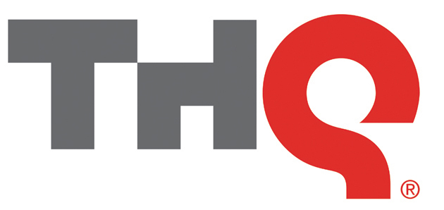 Old
Old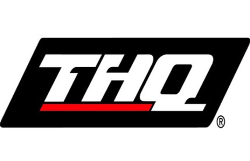
"Over the past few years the gaming industry has seen an unprecedented period of innovation," Farrell said. "You can see it in the deep, rich storylines, in the expansion of social and mobile gaming, and in the introduction of new technologies that enhance the gaming experience. THQ is proving its commitment to deliver the best experience to gamers through internally developed original intellectual properties (HomefrontЩ and uDrawЩ), creative partnerships, (Guillermo del Toro and Tomonobu Itagaki) and new talent acquisitions (Patrice Dщsilets), in order to solidify its position as a flagship publisher of extraordinary interactive entertainment."
The new logo shouts Apple-like simplicity and singles out the Q, which THQ's executive vice president of Core Games said "stands for Quality." Long gone are the days of Toy Headquarters, and we're pretty sure that everyone is in agreement that that's a good thing.


 Blockbuster Inc Arrives in June With The Demo Available Right Now
 Nintendo eShop Weekly Update Includes Princess Peach, Baseball, and More
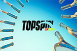 Top Spin 2K25 Roster and Apparel Brands Details Revealed
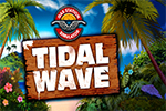 Gas Station Simulator “Tidal Wave” DLC Now Available on PC
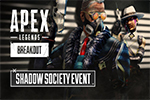 Apex Legends Shadow Society Event Launches Next Week
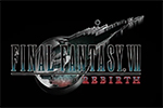 Final Fantasy VII Rebirth Update 1.020 Now Available on PS5
 Nintendo Reveals Mario Day 2024 Details for Fans
 Call of Duty Modern Warfare III and Warzone Season 2 Reloaded Details
 Monarchy Demo Now Available on Steam During Steam Next Fest 2024